Meet Ryan Bradley
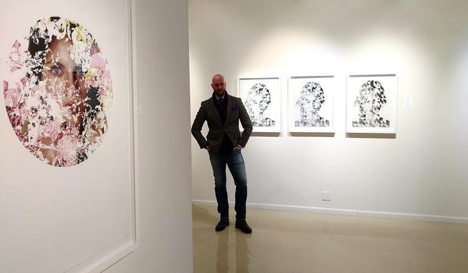
New York-based artist Ryan Bradley is best known for his photo-realistic style as expressed through his intricate, pastel renderings of the female form, which are adorned and embellished through elaborately complex patterns and florals. Royal Talens North America Vice President Kyle Richardson sat down with Ryan to talk technique, medium, and of course, Royal Talens products.
Hi Ryan, thanks for taking some time from your busy schedule to chat with us. You’ve got a very interesting story that our readers will love to hear. First, you are legally blind. Please tell me about that and how it impacts and informs your art and your process?
Keratoconus is characterized by sever distortion and the ghosting of images. Essentially, several singular images sit on top of and circulate around one another, blurring the overall object being viewed. Because of my failing eyesight, I am forced to work very close to the paper/page/canvas. I can see relatively well extremely close up, though I often must go over mistakes and smears caused by my nose rubbing against my paper as I work.
You are the youngest artist I know, showing at major galleries using pastels. Why this medium and how did you come upon it?
As opposed to receiving a degree in Painting, the greatest tool that my degree in Illustration ever gave me, was the idea/conviction that artists should employ whatever tools necessary to create the strongest, most efficient embodiment of their idea. Many fine artists get hung up on the notion that oil on linen is considered paramount, and this negates an entire world of mediums and applications. Experimentation is how I have arrived at every break-through that I have ever made.
I consider myself an artist first and foremost; pastel happens to be my preferred medium of choice. I originally started using pastels merely as a means to block in shapes and add details to my ink/watercolor/gouache paintings. Eventually, I found that the pastel elements were taking precedence over everything else. All of my previous work with the water-based media was being replaced with that of pastel, so ultimately, I removed the under-painting entirely, opting instead for a fully realized pastel painting.
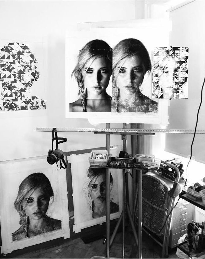
Your works involve both analog representational paintings of the human form, as well as intricate digital, geometrical manipulation of those renderings. How does each part of the process unfold?
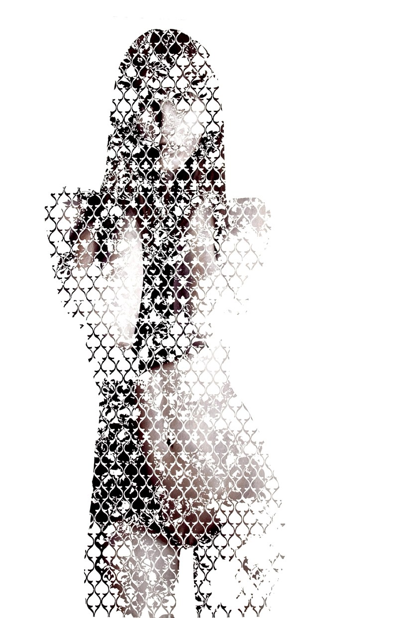
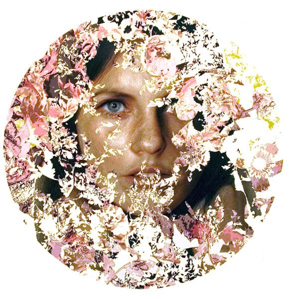
My work investigates the deconstruction of the figure through the migration of complex patterns. The paintings are primarily sequential, incorporating numerous puzzle pieces that together form a whole.
I am a realist painter, who has very little interest in traditional Realism. Instead, the story that I am trying to tell, is much less about the model, than it is about the abstraction. Within my work, pattern becomes the predominate focus beyond the model. The face and figure are quite literally used as a canvas for me to explore pattern, abstraction and nuanced variation. Working with one model as means to convey this abstraction, these patterns overlap, invert and subtract one another to create distinct interpretations of a single image. Each piece informs the preceding image and vice versa; they are taken as a whole, not individually, to complete the puzzle.
I approach the construction of my patterns in exactly the same manner. Within a series, patterns are collaged together, creating unique assemblages. The architecture of each system is abstracted through the interlacing and weaving of subtracted elements. Often dissolving at the point of intersection, each ingredient competes for prominence of position within the foreground. Subtle nuances in sequence shift the balance entirely and force the viewer to call upon a recollected resource to tile and complete the pattern collectively.
Once I arrive at my pattern, I delicately hand-cut a stencil to protect the white of my paper. This stencil will remain affixed to the paper for the entire duration of my drawing process, often many months. Upon completion, it is then peeled and discarded, negating huge portions of my work, though unveiling/revealing the crisp, clean lines of my pattern beneath.
You’ve recently been involved with the pastel society of America, which is great for them. How do you now see pastel as a medium evolving?
I love the Pastel Society of America; they have been warmly welcoming of me. That said, pastel is rarely thought of as a medium employed and championed by groundbreaking, explorative artists. Despite an incredibly rich and vibrant history, there currently is clearly a great chasm in both age and artistic intent. How do we make pastel alluring to younger artists, and to the generation of artists currently enrolled in BFA programs?
Pastel still rests in the stale shadow of Academic Realism, but with more progressive artists such as Barnaby Whitfield, Eric Yahnker and others exploring more contemporary, edgier themes and applications, the medium of pastel has the chance to break free of the tired tropes of still-lifes and sunsets that tend to deter more conceptual artists from utilizing the medium. I believe that it is slowly gaining momentum among contemporary/progressive artists. Artists like Whitfield and Yahnker certainly help to promote this shift, as they, in turn will hand the reigns off to a newer generation of artists pursuing the pastel medium.
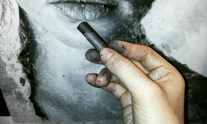
How do Rembrandt pastels work within your process? Why are they important?
Rembrandt pastels are both the very first and very last pastel used on every single painting that I have ever made in my professional career. While I will use other brands to block in shapes, the hardness, consistency and durability of Rembrandt pastels afford me the ability to achieve details that I absolutely could not otherwise.
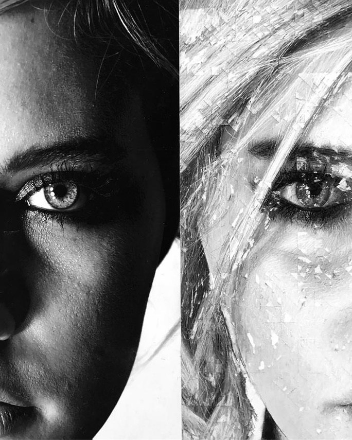
One hundred percent of the overall landscape of each painting is filled with strokes created by Rembrandt pastels. Mark making is a crucial element within my process; I do not use the typical method of blending colors with my fingers, as most pastel painters prefer to work. Instead, my process more closely resembles Pointillism.
Shadow, value and individual features are built up through the repeated application of gestural marks, generally working in order from dark to light and in descending size. Thousands of loose marks of color rest on top of one another, akin to the manner in which a Seurat painting is constructed. Each mark is then meticulously blended by repeatedly etching the sharpened edge of the angled pastel, cutting through the softer marks, and then softening the contrast between each. It is an extremely laborious process, though it is essential to achieving details impossible with softer pastels.
Design seems to be important to you in every aspect of life, from your work, to your dress and your décor, tell me more about that.
I am interested in every facet of design, and am enamored of all carefully considered aesthetics. Composition, form, color, symmetry, silhouette, contour, proportion, and balance: these are all elements equally important to both fashion and other studies of design as they are to painting and drawing. Pulling influence from many forms of decorative arts, textile design continues to be my main source for inspiration, specifically, the elaborate ornamentation of Victorian floral motifs and Baroque design. The current series titled Fabienne I-V was developed as a system of successional tessellations, puzzling hard-edged geometric forms loosely inspired by Anni Alber’s etching titled Second Movement IV, 1978.